Keep Your Readers Reading with the Packet's Highlights

Written by Steve Smith on August 28th, 2023

Steve Smith is a QA and Customer Support Specialist for ScriptHop, where he transitioned after a 20-year career in technical writing. He delights in helping to improve the tools ScriptHop provides, plus teaching writers to wield these tools like ninjas.

Sit down, good screenwriter. We need to talk about your packet's Highlights section.

Remember that a major challenge for writers (especially those seeking to charm Hollywood) is keeping a reader's attention. Whether a script analyst, an agent, or a high-ranking exec, your reader is most likely distracted, time-starved, and so overburdened that they're looking for reasons to dismiss your project so they can turn to the next prospect. Don't let them. Keep them intrigued, keep them curious, keep them reading.

Okay, but how? Apart from obvious boons like solid writing and presentation skills, you might have an underused tool in your arsenal: the Packet's Highlights.

You're already a user of the Packet, we shamelessly presume? If not, consider this article by our Advisory Board member, CJ Walley of Script Revolution, which explains very clearly why the Packet is worth your while, and just generally freakin' awesome.

Contents

Highlights: What they are and why they matter

Highlights are exactly that: your project's best parts, which you want every reader to remember. When you consider your overall vision, certain gems rise to the surface: a haunting line of dialogue, an epic action sequence, a profound theme, etc. Of course a careful reading of your packet and script might reveal these gems, but you cannot presume any such attentions from the industry's hurried and harried readers.

Enter the Highlights (unique to the ScriptHop Packet): a looping carousel that draws the reader's eye with a sense of motion, revolving through each facet you have chosen to highlight for your project. This section has many ways of impressing and ensnaring the reader, but its two primary prongs of attack are:

  • Spotlighting your best writing. This is typically your most gleaming lines of dialogue, but can include other content too, such as descriptions and more. You have (we assume) sweated over every word of your materials, and no reader should walk away without seeing the finest fruits of your labor — nor be in any doubt of your talents as a writer.
  • Immersing the reader with imagery. Film and TV are visual mediums, and therefore — while text is essential to any packet — imagery can immerse the reader in your story's look-and-feel far more vividly and efficiently than words. A single strong image might make the difference between a reader dismissing your packet and being intrigued enough to keep reading.

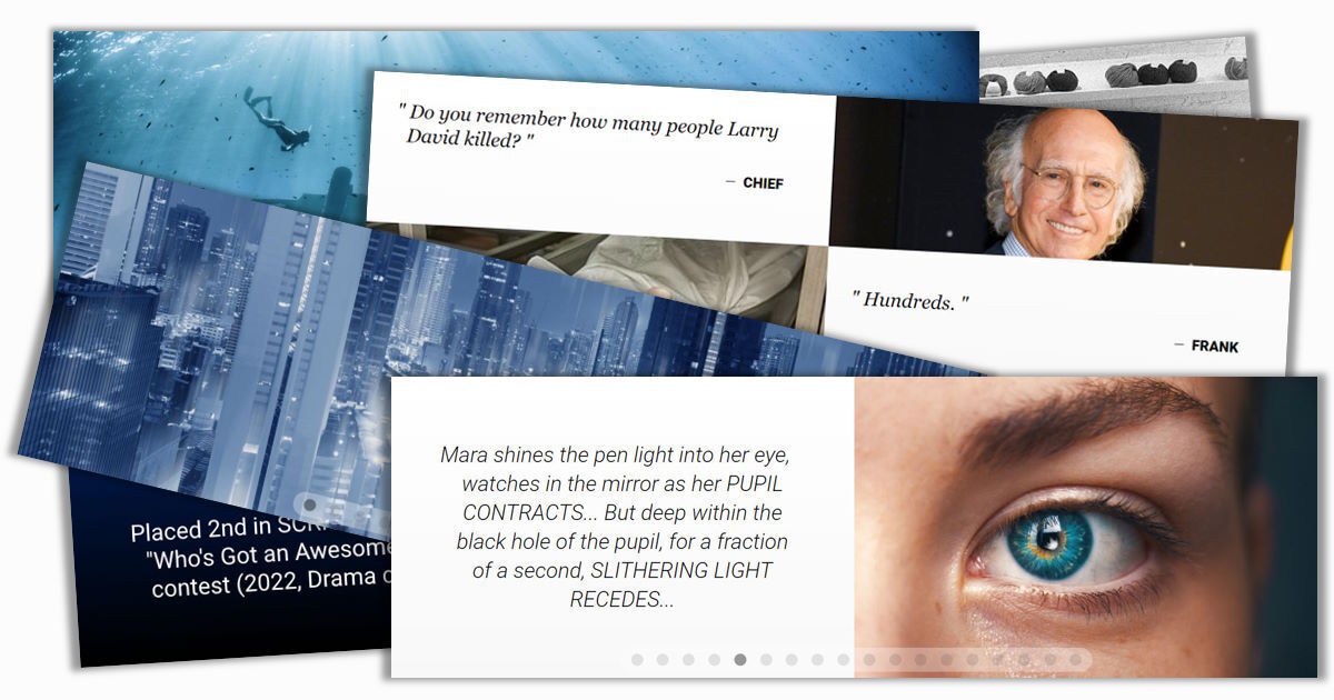
Let's look at a well-designed example: the Highlights from one of our demo packets, Starboard. Click the play button below to view it, and note that it includes a few snatches of pivotal dialogue and description, but relies heavily on imagery to bring the story to life — even though we might not yet know all the details:

Notice how quickly you've gotten a palpable sense of how this story might take shape — and all within a few inches of screen space. When you can accomplish such a feat with your own story, that's a truly gratifying moment.

But, like most art, Highlights like these don't happen by themselves. If you have uploaded a script to a packet, you might have noticed that the ScriptHop system automatically assembles default Highlights by selecting a few lines of dialogue. This is meant to give you a starting point only — a placeholder that should definitely be customized for your vision.

But, like most art, Highlights like these don't happen by themselves. If you have uploaded a script to a packet, you might have noticed that the ScriptHop system automatically assembles default Highlights by selecting a few lines of dialogue. This is meant to give you a starting point only — a placeholder that should definitely be customized for your vision.

For example, I created a packet using the actual script from the iconic sci-fi thriller The Matrix (Warner Bros., 1999). Click play to see the dialogue samples the system selected:

These selections are only meant to give a sense of how Highlights work. Like your own packet's default Highlights, they need revising to reach the caliber of the Starboard example above.

But this is well worth your efforts — especially because Highlights appear early in the Packet, soon after the title. This near-top position means the reader is far more likely to see your Highlights than something that requires the patience and attention to read farther down, such as your Story Hook or Intro to Characters. If you can immediately raise some eyebrows with an evocative image, a lyrical writing style, or a compelling new idea, the reader is far more likely to settle in and give your packet the time it deserves.

So don't neglect this opportunity to dial up the intrigue. It might be the only one you get.


The building-blocks of Highlights

Now I'm not speaking to all of you, but after seeing a lot of Highlights during packet reviews, we've seen that many of you are sticking to dialogue samples only, possibly even the default ones (like the "needs work" example from The Matrix above). So let's dive in and really tailor this thing. We'll start with the basic units: panels and cells.

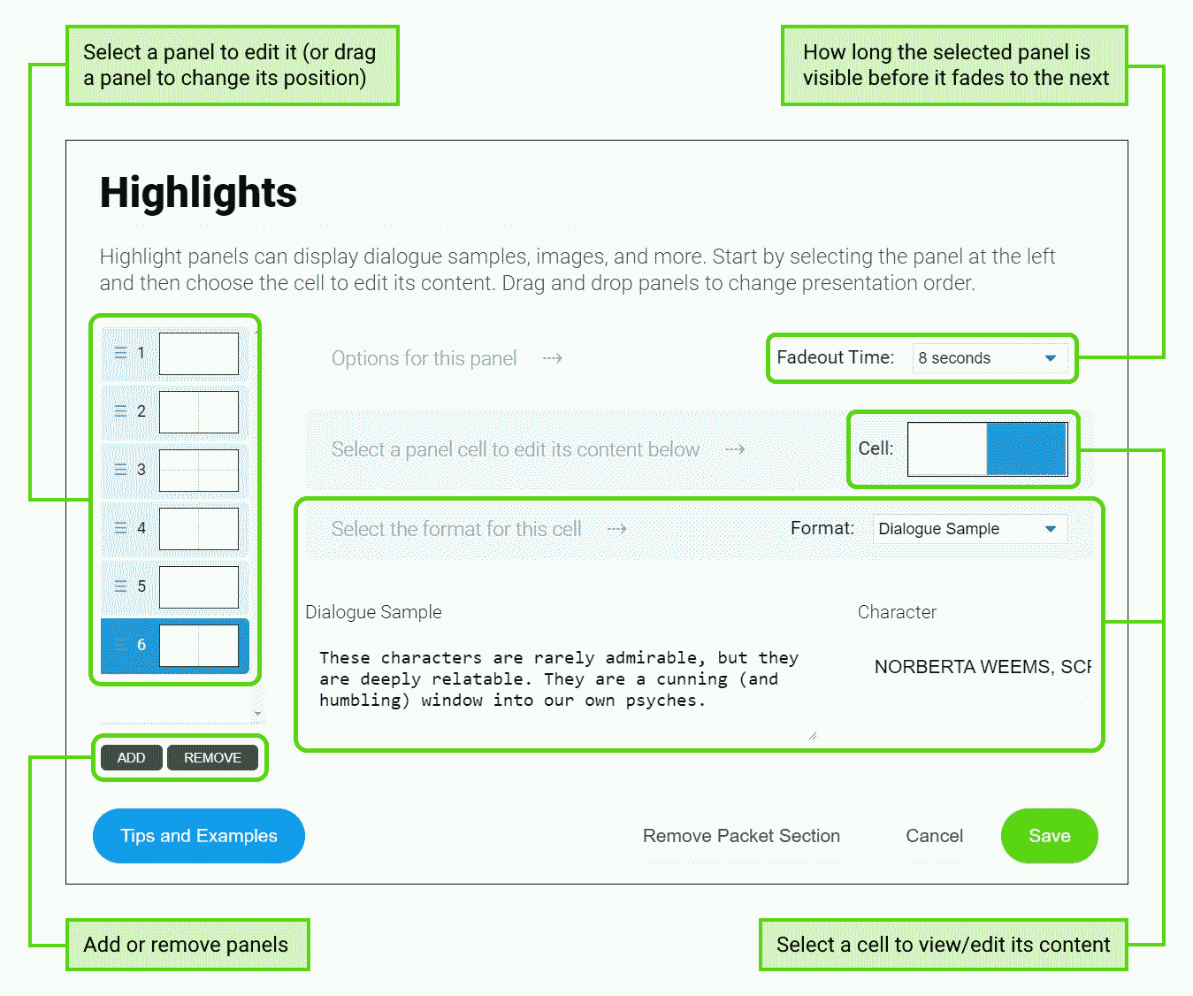
A panel is a "page" of your Highlights. Panels are shown sequentially (like slides in a slideshow), and each remains visible for a specified amount of time before fading out; this allows different pacing — from rapid-fire to contemplative — to achieve the sense of motion that best fits your content. After the final panel is shown, the Highlights loop back to the first panel and replay.

A cell is a portion of a panel, and shows only a single type of content (like a dialogue sample, an image, etc.). As you might have noticed in the Starboard Highlights above, each panel can have one, two, or four cells:

Panel with 1 cell that occupies the whole panel:

Panel with 2 cells side-by-side:

Panel with 4 cells in a 2x2 grid:

You'll note that the cells above show different content. This is determined by each cell's format:

An Image cell shows an image — either a JPG/JPEG or a PNG. Take a moment to compare the differing cell dimensions in the three panel layouts above; all cells have a landscape orientation (more wide than tall), but in 1-cell and 4-cell panels especially, each cell has "letterbox" (much more wide than tall) dimensions, so remember this when selecting images. A portrait-oriented (more tall than wide) image, for instance, will need careful cropping to fit elegantly into a Highlights cell.

A Dialogue Sample cell shows text formatted as a quotation, followed by the name of its speaker. This is most often used to show dialogue from a script, but can also showcase a quotation of something (relevant, of course) from outside your script.

A Description or Tagline cell shows simple text. This can be non-dialogue text from the script (such as an epigraph or description), a tagline/slogan* for your story, or any other text that helps introduce, vivify, or deepen your vision for the reader.
________________________
*Such as the classic tagline from 1979's Alien: "In space, no one can hear you scream."

A quick recap before we move on:

  • Each panel is a "slide" in your Highlights "slideshow" and includes one of the following:
    • One cell (that occupies the whole panel)
    • Two cells (side by side)
    • Four cells (in a 2x2 grid)
  • Each cell shows one of the following:
    • An image
    • A dialogue sample (or other quotation)
    • A description, tagline, or other plain text


Stacking the blocks

Now you know the building-blocks of Highlights, so it's time to learn the artistic part: combining them into a compelling blend of sensations for your reader. Like ingredients in a recipe or notes in a tune, few (if any) cells in your Highlights operate in a vacuum; they are inherently interwoven, each influencing how the others are experienced.

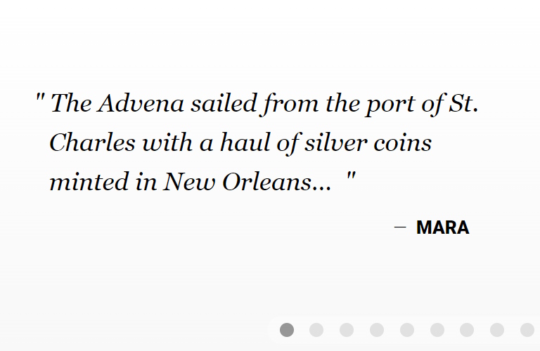
For an example, here's a simple panel from the Highlights of another demo packet, Don't Laugh:

Note how — because this dialogue sample and image appear side-by-side — they become more than the sum of their parts. The dialogue sample (if read on its own, without context) could come from almost any coming-of-age story — a young (or at least inexperienced) person realizing they have some living to do. And the image (viewed by itself) could be just a black-and-white photo of a knitwear shop.

But because these two things appear together, we get more: The image enriches the dialogue, giving Violet's predicament a unique flavor — perhaps she's always seen the world through a gray haze, or her world is a literally gray dystopia. And the dialogue adds depth to the image: It becomes not just a shop photo, but a human experience of being suffocated by a sterile and shapeless environment.

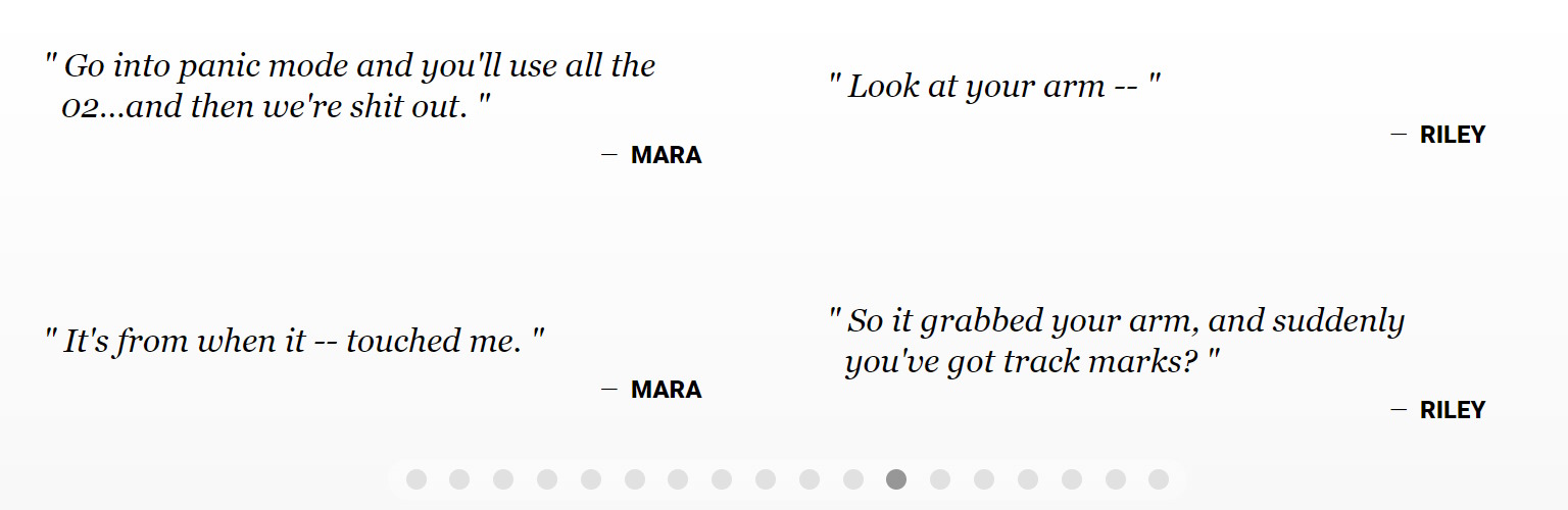
Here's another Highlights panel, also from Don't Laugh:

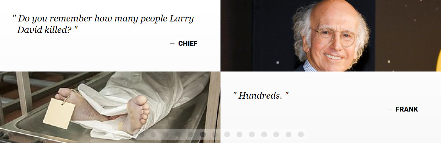
Not only do the images enliven the dialogue and vice versa (as if Chief and Frank are having some grim flashbacks), but more granular interactions are also happening:

  • Dialogue vs. dialogue: Because these two Dialogue Sample cells appear in a single panel, the effect is two characters having a conversation; you can hear this exchange happening. Contrast this with the Matrix placeholder example you saw above: Because all its Dialogue Sample cells quote a single character (Morpheus), the awkward effect is Morpheus talking to himself. So when you have multiple Dialogue Sample cells in succession (and especially in a single panel), be aware of how they resemble a vignette of conversation — and therefore should play like one.
  • Image vs. image: The contrast between these images is startling: smiling, carefree Larry David vs. a corpse in a morgue — just one of "hundreds" (if we believe Frank) somehow slain by Mr. David.* This arresting juxtaposition gives each image a feeling that it would otherwise lack: Larry's showbiz grin is suddenly ominous, and the toe-tagged cadaver now raises a lot of questions. Side-by-side images are almost guaranteed to affect each other somehow, so when you combine images (or any pair of elements, really), always make sure they combine into the flavor you want.
    ________________________
    *Note to Larry David's lawyers: Don't Laugh is a work of fiction. Its author is not suggesting that your esteemed client has killed anyone — except in the metaphorical comedic sense.


Thinking outside the cell format

Before we dive into building your own custom Highlights, here's one last tidbit for your toolbox: Each cell format has multiple uses. Glance back at the examples we've seen so far, and you'll notice that each cell is showing the standard content for its format:

  • Image cells show concept art,
  • Dialogue Sample cells show lines of dialogue from the script, and
  • Description cells show descriptions from the script.

There's nothing wrong with using standard content (it's what these formats were designed for, after all), but remember that you are not limited to this. You might find creative ways to repurpose every cell format.

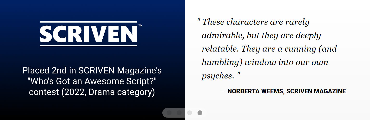
For example: Suppose your script has won a contest or earned some other distinction, including some noteworthy praise (say, from a judge at said contest). A Highlights panel could showcase this for your readers. The example below does so via an Image cell (to indicate this script's placement in the contest, plus catch the eye with a logo) and a Dialogue Sample cell (a format easily repurposed to quote the judge's comment):

So when you want to spotlight something outside your script, consider whether any of the available cell formats could do it justice. Just two cautions about this:

  • Make sure it's a good fit. Certain non-standard content just isn't going to look polished in any of the Highlights' cell formats, so don't force anything where it's an awkward fit. Instead, look to your packet's other sections and see if the content might deliver a more natural presentation elsewhere.
  • Don't confuse the reader. When using a Highlights panel for non-standard content, you don't want the reader thinking that this is from your script — e.g. (using the contest kudos example above), that Norberta is a character who speaks those words as dialogue in your story. So, if you have any "extra" content like this, consider placing it in its own dedicated panel or otherwise making clear that this is separate from your script.

Take a breath. We're about to dive into actually building your Highlights. If you've never done this before, then you'll be looking at your project from new angles and mining its depths for jewels you didn't know were there.

This might sound daunting, but remember to have fun with this. Just settle into a playful attitude and a willingness to learn...and to be surprised. Like many areas of the Packet, Highlights guide you to shine new lights on your story and might bring new insights on how you can make it even better.

Okay. Ready? Three, two, one...

Let's do this: Building your Highlights

We can't guarantee this first attempt will result in flawless Highlights — as the vagaries of storytelling are both legion and unpredictable — but it will get your feet wet and provide some hands-on insight into where to take things from here.

To customize a packet's Highlights section:

  1. Watch your default highlights. If you have uploaded a script to your packet (during the packet's creation or later), your packet likely has a default Highlights section. Observe which dialogue samples the system chose. Take note of what you like, what you don't, and (most importantly) why. This will help you clarify your own thinking and approach.
  2. Pick a strategy. There are many strategies for building Highlights. You can take a simple approach — giving a sampler of your story's best moments — but below are some more directed strategies. Choose one of these, a hybrid model, or something entirely different. A strategy gives you a blueprint to work from; it's easier to select text and imagery when you know what role each selection needs to play.
    • Vision or World-Building Board: This strategy relies most heavily on imagery, aiming to immerse the reader in the atmosphere of your story's world. This might be especially effective for projects where the setting is both unfamiliar (to the average reader) and important — anything from sci-fi epics and period dramas to stories in modern-yet-niche settings, like a research submarine or a Marrakesh souk.

      Here are the full Don't Laugh Highlights, which use this strategy. Click play, and note the frequent vivid imagery that portrays its setting (a futuristic yet bleak America) as well as the covert and colorful elements who threaten the prevailing culture. Also note that it's not just imagery; text selections also hint at the story unfolding in this world.
    • Trailer: This strategy is based on the classic movie trailer approach, answering "What is the story about?" without revealing any spoilers. This can be organized by phases of the story. For example: For a movie with a three-act structure, you might devote the first few panels to Act 1 (e.g., introducing the setting and main characters), the next few to Act 2, etc. These panels highlight moments from their respective acts, but might get gradually more vague, so the final panels (like the final moments of many trailers) can hint at a high-stakes climax without giving away any endings or twists.

      The Highlights of Starboard use this strategy, so click play below to give them a second look. Note how the early panels unveil the premise and setting, while later panels get progressively darker as the story's conflict and threats take centerstage. The end suggests a resolution of sorts, but with many burning questions unanswered.
  3. Sketch it out. When you have a sense of your strategy and vision for your Highlights, map it out like a storyboard. You needn't be an artist to do this — just find some scratch paper or a whiteboard and do a rough sketch of each panel, along with its cells' contents. This gives shape to your vision, so you can start to see not only how each panel might look, but also how it builds on the information and sensations of the preceding panels.

    As you conceive each panel, you'll be considering how many cells it should have. Think about how multiple cells influence each other (as discussed above), as well as when a cell merits its own dedicated panel. If a cell's content is especially poignant, revelatory, etc., you might not want any other cells sharing the spotlight, lest they detract from the primary impact. But always remember: This is just a rough sketch. You can easily draw multiple versions of any panel to see which one strikes the right tone.
  4. Collect your imagery. If you don't have all the images you need for your Highlights, take some time to find them now. These might be the results of online image searches, AI-generated imagery, images contracted from an artist or photographer, and/or images you produce yourself. Packet imagery is a sprawlingly large topic that we cannot explore thoroughly here, but here are some reminders and guidelines to get you rolling:
    • Respect copyrights and any other restrictions on an image's use. If you need to answer some uncomfortable questions later about your packet materials, that's not a good look.
    • Images must be of the JPG/JPEG or PNG format. (As of this writing, ScriptHop does not yet support the WebP image format. To use a WebP image, you will need to convert it to a supported file format before uploading it to your packet.)
    • Use high-quality imagery. A reader might view your packet on anything from a phone to a widescreen TV, so you want quality, high-resolution images that will never appear grainy or pixelated.
    • Every Highlights cell has landscape or letterbox dimensions, so it will be easier to work with images that are more wide than tall. If an image is more tall than wide, you do not need to crop it before you upload it, but the process of uploading will include selecting which portion(s) to crop out to make it fit the cell.
  5. Implement your vision! In ScriptHop, open your packet's Highlights editor (found under Info > ENGAGE THE AUDIENCE). Start adding panels and defining the cell content of each. (If you're not sure how to use the Highlights editor, see the diagram below for the basics.) You can always adjust the order of the panels, so you don't need to create them in precise order.

    For now, don't worry about each panel's fadeout time (found in the upper right of each panel's details); this is how long the panel remains visible before it fades out and the next panel fades in. Just enter your best guess for now, and we'll fine-tune it shortly.
  6. See how it plays and adjust fadeout time. When you're done drafting your Highlights in ScriptHop, click Save and watch your new Highlights play in your packet preview. Scrutinize it for possible improvements, especially in each panel's fadeout time.

    You want every panel to be visible long enough for the reader to absorb it, but not so long that they get bored. Also consider — like an editor cutting and splicing different lengths of footage — the sense of motion that best fits each transition. (For example: Some content with an inherent sense of urgency — such as an image of a weapon being drawn, a panicked glance, a train speeding out of control, etc. — might warrant a shorter fadeout time to deliver a more frenzied pace.) So take note of any panels that remain visible for too long (or not long enough), then go back to the Highlights editor and fine-tune the fadeout time for those panels.

And with that: Congratulations! You have drafted your own custom Highlights.

Where to go from here? As a writer, you're surely aware: If you're too close to a project for too long, this can distort your view of it. Consider putting your Highlights aside for a few days and focusing on other things. When you can return with fresh eyes (which is much closer to the perspective of the readers you're hoping to impress), you might see opportunities for improvement that you missed before.

Then, when you're ready, show your new Highlights to your screenwriting comrades and anyone else whose instincts you respect. Listen to their unprompted comments, but also have some questions ready: Do the Highlights show too much, or too little? Do they ignite the viewer's imagination in the way you want? Does the pacing (i.e., each panel's fadeout time) make the Highlights as compelling as they should be? Not all feedback is valuable, of course, but outside opinions can offer a preview of how your hoped-for readers will react.

And remember: Your Highlights are never set in stone. Whenever you see a way to improve them, you can always revise, and you now have the tools to do so. Enjoy the process, and if any questions come up, don't hesitate to contact support at support@ScriptHop.com.